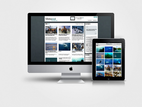

I recently wrote a blog on why mHealth companies need to develop a mobile strategy. Now that you are thinking about developing your mobile strategy, it’s time to give some thought to executing the strategy. Should your mobile site be a miniature version of your main site? How should you present content? How can you deliver the best user experience?
Here are some tips worth sharing from the Content Marketing Institute:
mHealth Mobile Website: 7 Tips to Effective Mobile Marketing
1. Keep it simple
Your mobile website home page should only display the most relevant information. Do not try to cram all the information you provide on your website into your mobile site. Instead, include a link to the desktop version from the mobile site. Include information like phone numbers, addresses and maps which would be useful to people on the move.
2. Don’t make ‘em wait
To retain your mobile visitors’ attention, your mobile website has to load in less than 5 seconds. It’s been found that 58 percent of mobile phone users expect websites to load as quickly, or faster, on their mobile devices as they load on their desktop computers.
3. Avoid “heavy” graphics
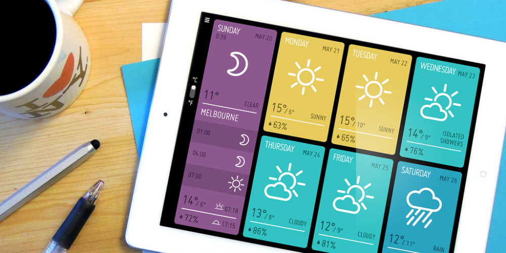
Avoid using large, Flash-based video files on your mobile site, as most smartphone browsers do not support Flash. Instead, use simple images to improve the look and feel of your mobile website — but make sure all images used on the desktop are set to resize automatically to fit a mobile device’s smaller screen sizes.
4. “Touch” is the new “click”
When designing your mobile site, use drop down menus, check boxes, and pre-populated fields whenever possible, so that your mobile visitors can navigate and input information easily rather than having to fill in long forms.
5. Every device is important
Your mobile website should work flawlessly on devices with various screen sizes and on various mobile platforms and operating systems, including iPhones, iOS, Android, Blackberry, Nokia, and even feature phones that use Opera browsers.
6. Redirect your mobile visitors automatically
Do not forget to redirect your mobile visitors automatically to your mobile website. Your webmaster can do this by creating a subdomain of your main website which will serve as your mobile website.
7. Track your mobile visitors
For all you know, your mobile website traffic might have surpassed your desktop website’s traffic. If you have an analytics system in place, such as Google Analytics, create a separate profile for your mobile website. This will help you track your mobile traffic and desktop traffic independently.
Recent studies back up many of the points above, especially when it comes to loading times. According to a study by Compuware, 60 percent of mobile users said they expect a mobile site to load in 3 seconds or less! When it doesn’t, 57 percent won’t return. It’s pretty clear, you can’t afford not to pay attention to these statistics.
For more information, download our free Mobile Marketing Tip sheet


7 thoughts on “7 Ideas to Create the Best Mobile Website for Your mHealth Company”